


At Nurun/Razorfish we worked onsite with Walmart product owners in what was more like a partnership than client/agency relationship.
With daily standups and truly agile design/dev methodologies, we worked collaboratively and iteratively with the product teams to design, test and release features across different product lines.
Among other things, our team was responsible for the first iteration of Walmart’s online grocery checkout and delivery service as well as Walmart Canada’s first mobile app.
With our team working as an extension of the Walmart product teams, all of our initiatives were based on and driven by measurable business goals.
User-centric design was at the core of our team’s approach and we applied ongoing research, analytics and testing to our work.
Problems were always reframed in terms of a customer need, and in all conversations with product owners, the voice of customer was represented with research and data.
Working in 2-3 week sprints we were able to break big problems down into executable tasks and stories that aligned with development releases and ongoing product roadmaps.
Over time the mobile site header had become cluttered. With new features planned and questions about the current performance of the header, I was tasked to explore ways to optimize the current experience.
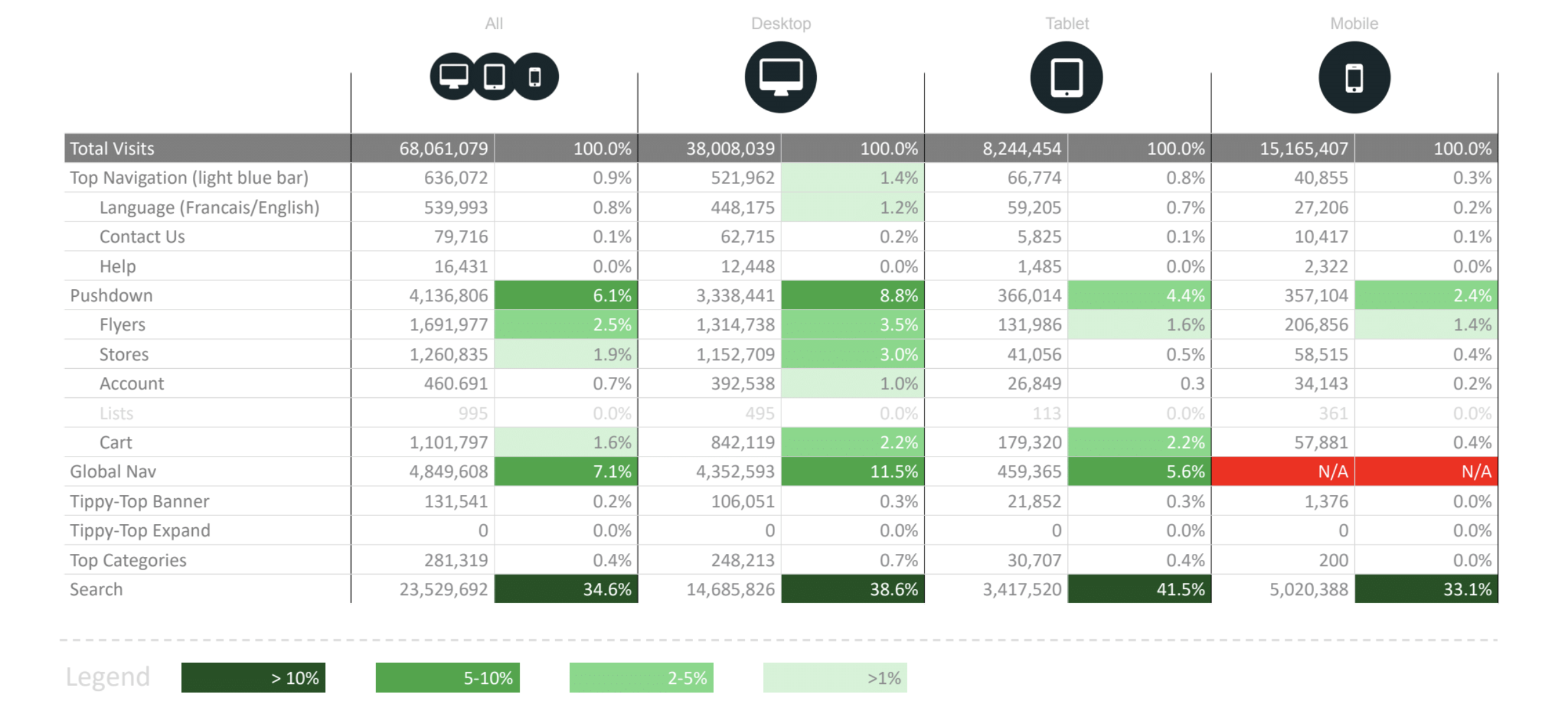
At the outset of any design sprint, I would always ask our Data Analyst to pull some numbers. In the case of the mobile header, I was interested to know how users were interacting with it. I also wanted to see how usage compared between the different responsive viewports.
A number of key findings were discovered:
- Overall the header accounted for 56% of interactions across devices
- Within the header, search was the most performed action across all devices at 35%
- Shop All was second, but significantly lower at7%
- Desktop users browsed most, tablet users second with only half as many instances (no data for mobile)
- Overall, desktop users interacted with the header most, mobile users the least, and tablet in between
- Desktop users accessed flyers, store finder and my account more than tablet and mobile
- Tablet users searched more than desktop and mobile users
- While some users clicked the tippy-top banner when it was open by default, nobody clicked to open the tippy-top when it was closed
- Cart pushdown accessed equally on desktop and tablet
- A fraction of users changed the language, clicked Contact Us, Help or Top Categories
- Registered users interacted with Account and Cart as expected, but otherwise little difference from guest users
In addition to looking at our own site data, I also carried out some secondary research, and reviewed competitor sites to determine any common patterns and best practices.
Before diving straight into wireframes and mockups, I prefer to generate ideas quickly with sketches. I do this alone in my sketchbook, and also in collaborative “sketching sessions” with members of the team, including product owners.
Sketches were often included in presentations to stakeholders in order to facilitate further discussion and ideation, and to get alignment before proceeding in a particular direction.
After exploring early sketch concepts I would create more detailed, high-fidelity wireframes and/or mockups in order to explore user interactions in more detail, determine feasibility with development, and ultimately test with end users.
After developing high-fidelity prototypes and mockups, the next step would be some method of testing - most often we used UserTesting.com to run quick, unmoderated tests, synthesize and analyze the data before moving into development and/or doing another round of design iteration if required.
Thanks for reading!
Check out more case studies below, or to get in touch, please connect with me via LinkedIn while I work on building out this site.